Getting Into Data Visualization

Every business has a story to tell that usually involves data. The Data Visualization Designers/Experts are responsible for using tools to display data using visual elements in a meaningful and compelling way that facilitates understanding. Data Analyst usually spent their day dancing in data, but since some companies don’t have a Visual Designer/Artist or a Content Marketer to tell a good story with the data, the Analyst becomes responsible for trying to capture their audience with compelling content through data visualization.
I started my jorney with data visualization as a system/data analyst, with the need to transform data into powerful content using visual elements to enhance business descision making. If you are a Data Analyst and are also responsible for telling stories using data, I recommend that you take the time to read and learn about data visualization, as implications can be profound when not properly told (wasted time, money, wrong action, etc.).
The main idea of this short post is to provide some guidance on where to start with Data Visualization. I will share a list of books, training videos and websites with useful information on this topic. There are many resources available on the internet, but I will list some that I found interesting and usefull to me. As I have a large list of books that I plan to read on the subject, this will be a post that I will update frequently in future.
Disclaimer:
The above background visualization was extracted from the book The Truthful Art Data, Charts, and Maps for Communication by Alberto Cairo and created by The Wall Street Journal. The website with the original visualization Track National Unemployment, Job Gains and Job Losses.
Data Visualization Definition
First, let me borrow the definition of Data Visualization from some websites:
Data visualization is the graphic representation of data. It involves producing images that communicate relationships among the represented data to viewers of the images. This communication is achieved through the use of a systematic mapping between graphic marks and data values in the creation of the visualization. This mapping establishes how data values will be represented visually, determining how and to what extent a property of a graphic mark, such as size or color, will change to reflect changes in the value of a datum.
Data visualization is both an art and a scienceSource: Wikipedia
I suggest visiting the Wikipedia and reading the entire page about Data Visualization, as it contains a lot of useful information in it.
Data visualization is the graphical representation of information and data. By using visual elements like charts, graphs, and maps, data visualization tools provide an accessible way to see and understand trends, outliers, and patterns in data
Source: Tableau
In case you are not familiar with Tableau, their products are used to translate queries into graph-type visualizations. Tableau software is one of the fastest growing data visualization tools currently being used in BI industry. Tableau was acquired in June 2019 by Salesforce.com in a $15.7 billion deal. It is an incredible software and I will definitely write some posts about it in the future.
Data visualization is the graphical display of abstract information for two purposes: sense-making (also called data analysis) and communication. Important stories live in our data and data visualization is a powerful means to discover and understand these stories, and then to present them to others.
Source: The Encyclopedia of Human-Computer Interaction - Data Visualization for Human Perception by Stephen Few
Stephen Few has over 20 years of experience as an innovator, consultant, and educator in the field of data visualization.
Introduction to Data Visualization Websites
There are a large number of websites about data visualization and I definitely missed creating some bookmarks. Below is a list of some sites with introductory material to Data Visualization.
-
What is Data Visualization? A quick introduction by Stephen Few.
-
Introduction to Data Visualization is a course by Peter Aldhous.
More related to charts:
-
IBM Data Visualization Overview.
Short introductions about Data Visualization by IBM. -
HubSpot + Visage Data Visualization 101: How to Design Charts and Graphs FREE E-BOOK
Very simple guide that will walk you through the common charts and visualizations, and give you some design tips and tricks.
Books About Data Visualization
In this section, you will find a list of books about Dataviz. Some that I read, others not yet and some that I just consulted. I hope to finish reading the books and then I will be able to provide a detailed review and comparison about them.

-
The Visual Display of Quantitative Information by Edward Tufte
Edward Tufte is an expert in the presentation of informational graphics such as charts and diagrams. Once you study Data Visualization more in depth, you will surely come across his name and publications. I found many articles and books describing his work and using the content of his books as a reference. I ordered his book collection (4 books) and I look forward to read his books in the near future. Edward Tufte’s website: www.edwardtufte.com -
The Truthful Art Data, Charts, and Maps for Communication by Alberto Cairo
This is a easy-to-read book with many excellent examples. This is definitely worth looking at. To have a taste, have a look at this interview with Alberto Cairo by Geoff McGhee for National Geographics. -
Storytelling with Data - A Data Visualization Guide for Business Professionals by Cole Nussbaumer Knaflic
It is a book with good examples and explanation which will help you improve you charts. -
Storytelling with Data - Let’s Practice by Cole Nussbaumer Knaflic
This second book from Cole is a practical guide with many hands-on exercises. The book is easy to follow. -
Data Visualisation - A Handbook for Data Driven Design 2nd Edition by Andy Kirk
Another great book. I liked chapter 6 on Data Representation, showing all types of charts, plots and visualisations, as well as explanations about when and how to use them.
More artistic books:
- The Functional Art by Alberto Cairo
Another book by the great information designer Alberto Cairo. This book is a must read for anybody starting in the field of information graphics and data visualisations. Alberto Cairo’s website: www.thefunctionalart.com
If graphic designer Nigel Holmes and data visualizer Edward Tufte had a child, his name would be Alberto Cairo. In The Functional Art, accomplished graphics journalist Cairo injects the chaotic world of infographics with a mature, thoughtful, and scientifically grounded perspective that it sorely needs. With extraordinary grace and clarity, Cairo seamlessly unites infographic form and function in a design philosophy that should endure for generations.
Stephen Few, author of Show Me the Numbers
- Knowledge is Beautiful by David McCandless
Great books showing how to create charts using R:
-
Data Visualization - A Practical Introduction by Kieran Healy
A good book for presenting data using R and the package ggplot2. -
Visualize This The Flowing Data Guide to Design, Visualization, and Statistics by Nathan Yau
Another book with good examples on how to present data using R, Python and Adobe Illustrator.
Some other well-recommended books that I haven’t read yet, but will receive soon:
-
Information Dashboard Design: Displaying Data for At-a-Glance Monitoring by Stephen Few
-
MakeoverMonday: Improving How We Visualize and Analyze Data, One Chart at a Time by Andy Kriebel and Eva Murray
A larger list of great books on data visualization can be found at the information is beaufitul website.
Training Videos to Data Visualization
The number of training videos available on the internet is also not short. I definitely like the LinkedIn Learning trainings, as they are not very long and, most of them, the content is really good. The trainings at Udemy is hit and miss, you can find some amazing courses, but some are below average. Well, anyone can create a Udemy course and this may explain why some courses are not so good. There are also some trainings at Skillshare and Pluralsight.
One great location for good courses and specializations is Coursera (e.g. Data Visualization with Tableau Specialization, Data Visualization with Advanced Excel, etc.), but keep in mind that Coursera takes a more academic approach. The majority of courses are offered by professors from actual colleges and universities. I am currently taking the ten-course Data Science Specialization offered by Johns Hopkins University. So far I’m enjoying the courses. The actual certificates may not be worth much, but in my case, I’m more interested in the value of the content of the courses.
Suggestions:
- LinkedIn Learning has a good amount of training videos related to Data Visualization. If you are a Data Analyst, I recommend to check the 12 lessons on visual communication by Bill Shander in his training Data Visualization for Data Analysts.
As a data analyst, you probably already know how to build visualizations and use tools like Excel and Illustrator. This course challenges you to go beyond the data, beyond the software, and start thinking more clearly and strategically about the foundations of great communication design
-
Data Storytelling and Visualization by Alberto Cairo for Microsoft.
This course I just found while doing some research on Alberto Cairo. In this course, he worked with Microsoft to develop five guided learning courses on visualization methodology for effective data storytelling featuring interactive Power BI demos. -
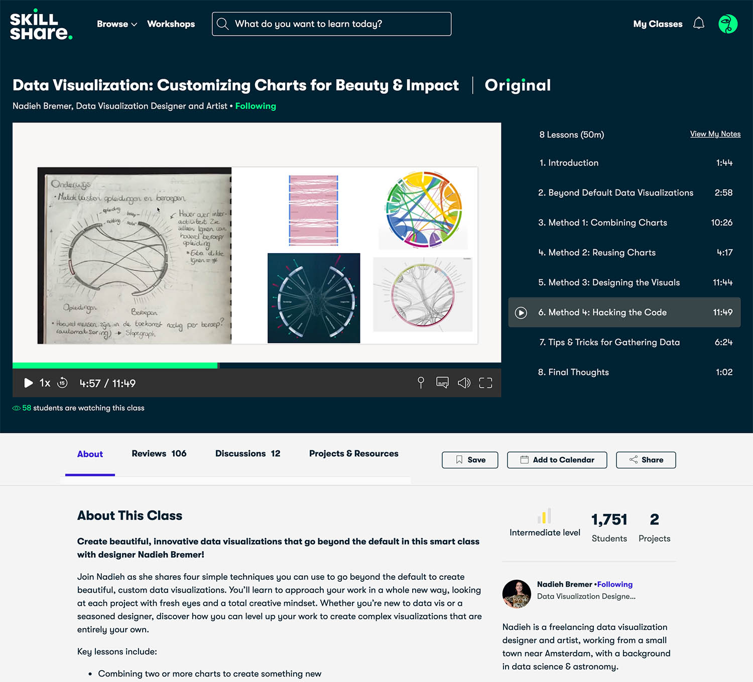
Data Visualization: Customizing Charts for Beauty & Impact by Nadieh Bremer at Skillshare.
She is an amazing Data Visualization Designer and Artist.
Websites
It will be very hard to choose some websites about data visualization, but I will list some which I check from time to time. A side note is that most of the authors mentioned above also have a blog (two of them listed below); therefore, look up for an author name on any search engine and you will most likely find a blog.
-
Visual Cinnamon from Nadieh Bremer. I discovered her website in 2018 while looking for some D3.js charts. Her work is very inspiring!
-
D3.js is the website for the greatest JavaScript library for manipulating documents based on data. See the gallery of examples to get an idea of what you can do with it.
-
The Economist - Graphic Detail is a good place to see what a “more standard” chart should look like. In this blog you find every working day a chart, map or infographic.

-
Information is Beautiful is a great place for inspiration. The website name says it all. Don’t miss beautiful news.
-
Flowing Data from the statistician and author Nathan Yau. You need to become a member to view some posts and access his tutorials and courses. I am not a member yet, but based on his book, the content should be great.
-
Visual Complexity from Manual Lima. The last update was long ago, but a good place to find interesting projects.
Summary
I hope you found some useful information about Data Visualization here. Let me know if I missed a very important website, course or book that I should have mentioned.
I didn’t write about data visualization software, as this needs to be a separate post.
Remember that I will update this page over time as I dive into the world of Data Visualization. So, don’t forget to visit this page again in the future.
A picture is worth a thousand words
by Fred R. Barnard